The Attention Economy Resistance
Hioii is not a to-do list. It is a time sovereignty system for knowledge workers, squads, and anyone exhausted by infinite feeds, reactive calendars, and productivity theater.
Brand Essence
Core promise
Reclaim your attention. Defend your time. Prove your rest.
Voice
Direct, calm, slightly rebellious, tech-literate.
Tone
Never corporate-jargon. Never toxic hustle. Always pro-human.
Metaphors
Armor, time-blocks, gates, gardens, signal vs. noise.
Moodboard & Art Direction
The visual base for photography, film and key visuals — plus the refinements that pull it closer to the Hioii system.
Light as the story
Single hard source: neutral light for the chaos side, cyan/violet for the sovereign side. No red or warm colour cast.
Split-world framing
The diagonal split — paper clutter vs. obsidian calm — is the core device. Keep it asymmetric, never a 50/50 mirror.
Time-blocks as objects
Blocks render as physical, extruded slabs with edge glow. They are things you place, not rows in a list.
Base moodboard
reference · v1
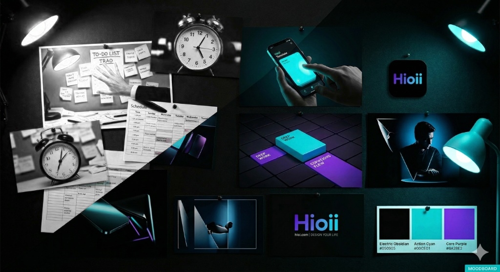
The base board establishes the thesis: analogue overload on one side, an engineered dark system on the other. Keep the diagonal transition, the physical time-blocks and the three-colour palette — Electric Obsidian, Action Cyan, Core Purple.
How to improve it
Deepen the blacks to hsl(240 7% 2%) so glows read as emission, not haze.
Grey-blue washes and lens flare stacks that flatten the contrast.
Limit accent to one hue per frame; let violet OR cyan lead, the other only edges.
Full violet→cyan gradients on photography — reserve the gradient for the brand layer.
Real hands, real desks, real skin texture. Documentary, not stock-smile.
Composited people in neon rooms, AI-glossy faces, floating UI in mid-air.
Set typography in Inter, tight tracking, always aligned to the frame edge or optical centre.
Centered all-caps captions with drop shadows sitting on top of a busy image.
Film storyboard · 10s
reference · v1
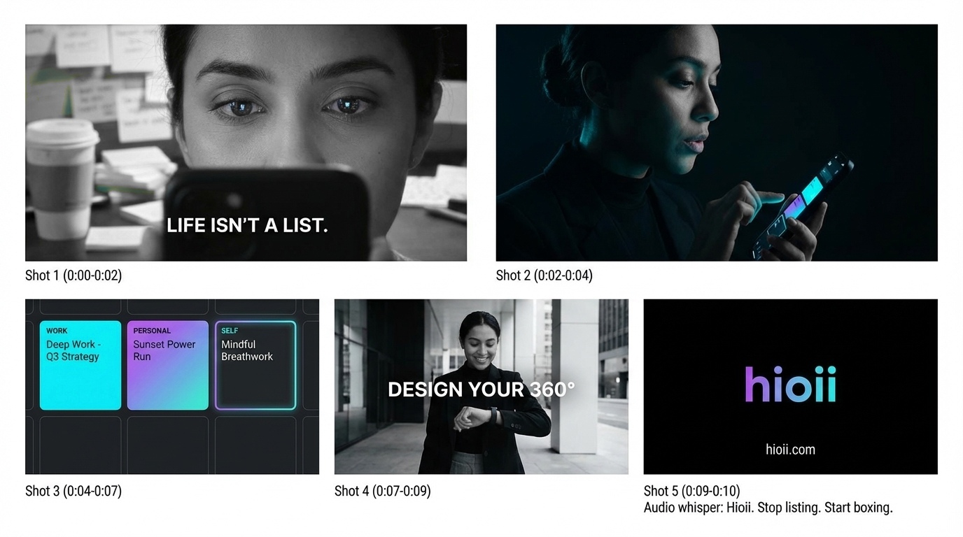
- 01 · 0:00–0:02LIFE ISN'T A LIST.Neutral clutter, shallow depth, eyes lit by the phone.
- 02 · 0:02–0:04Noise arrives.Cut to obsidian. Cyan rim light only. Silence.
- 03 · 0:04–0:07Blocks land.Time-blocks extrude into the grid, edge glow on impact.
- 04 · 0:07–0:09DESIGN YOUR 360°.Daylight, movement, wrist glance. Earned calm.
- 05 · 0:09–0:10Hioii · hioii.comBlack card, gradient wordmark. Whisper: stop listing, start boxing.
Color System
Hioii is a dark-first application. The palette is designed for long sessions, low eye strain, and high contrast. Brand applications use violet, cyan and neutral surfaces; red is not part of the Hioii palette. Warnings use violet with explicit text and icons.
--backgroundhsl(240 7% 2%)Primary canvas--cardhsl(240 7% 7.5%)Cards, panels, sheets--mutedhsl(240 5% 16%)Secondary surfaces--primaryhsl(271 81% 53%)CTAs, active states, links--accenthsl(183 100% 50%)Highlights, time lines, success--foreground#ffffffPrimary text--muted-foregroundhsl(240 4% 66%)Secondary textGradient signature
--gradient-primary: linear-gradient(
  135deg,
  hsl(271, 81%, 53%) 0%,
  hsl(183, 100%, 50%) 100%
);
Use it sparingly
- Hero titles
- Primary buttons
- Focus rings
- Brand moments
- Full-page backgrounds
Typography
Headings
SF Pro Display / Inter
Clean, geometric, Swiss-influenced.
Body
Inter
Highly legible at small sizes.
Monospace
JetBrains Mono
Time codes, durations, technical data.
Reclaim your attention
Defend your time
Prove your rest
Hioii is a time sovereignty system for knowledge workers and squads.
02:45:00 · FOCUS BLOCK · +1 INTERRUPT
Need to test real copy? Open the interactive specimen to adjust sample text, scale and line height.
Open typography specimenSpacing & Shapes
Radius
--radius: 0.75rem (12px)
Glows, not shadows
--glow-primary · --glow-cyan
Glass
Density
Compact by default. Mobile-first.
Logo & Applications
Wordmark
Bold, geometric treatment with violet/cyan accents.
Watermark
Hero images and videos carry a subtle Hioii watermark or end-card.
Video end-card
Always close on the logo plus the tagline “Reclaim your attention.”
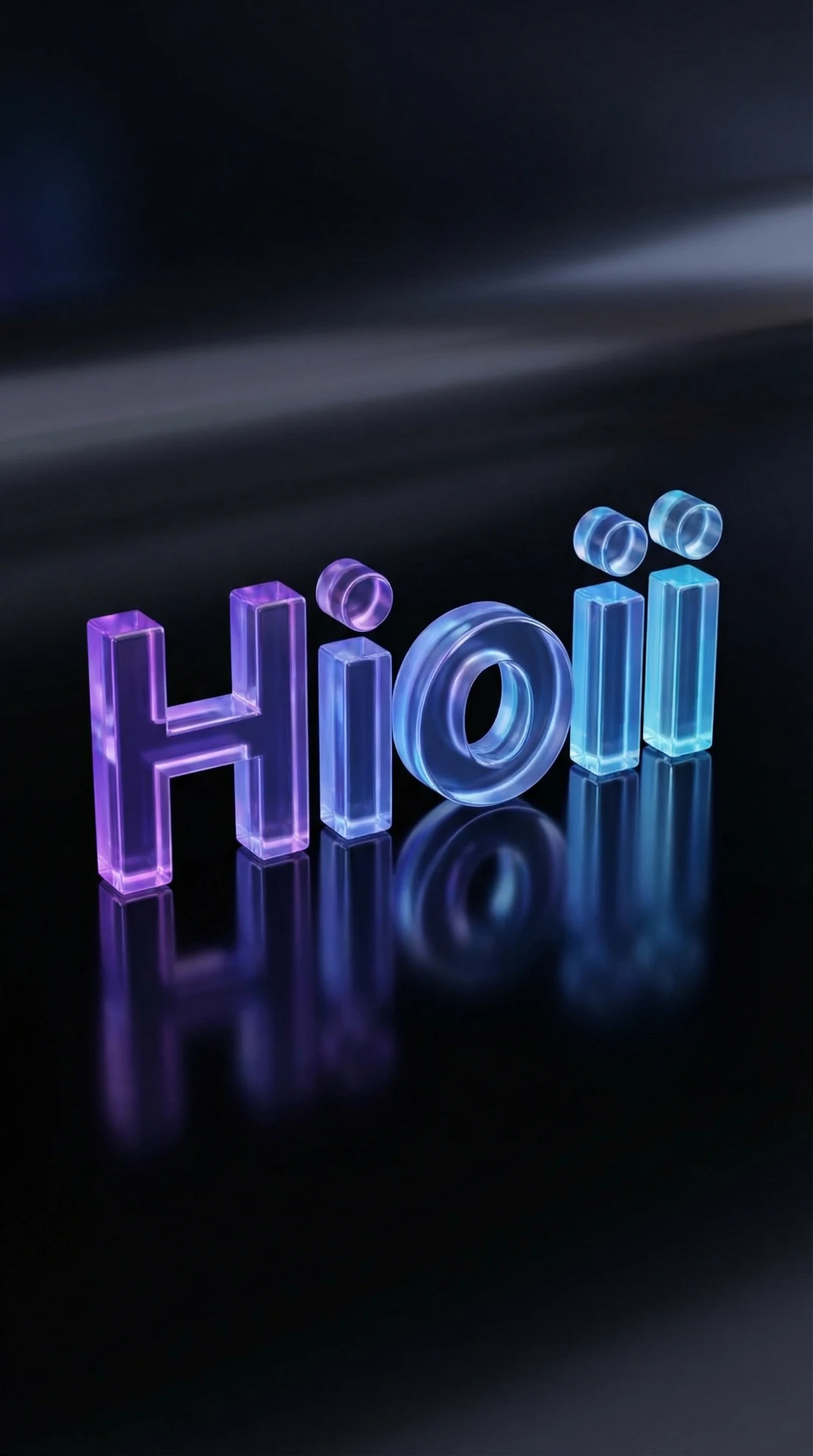 Crystal · 2K render
Crystal treatment
Translucent glass-render wordmark with violet→cyan refraction and a mirror reflection. Use for launch material, hero intros and large-format display — never below 240px.
When to use
- · Product launch hero & end-cards
- · Conference / keynote backdrops
- · App store feature graphics
Avoid
- · Inline or small-scale placement
- · Busy or competing backgrounds
- · Pairing with heavy glow effects
 Black · URL lockup
Black + URL lockup
Centered wordmark with hioii.com set in muted gray beneath, on a near-black canvas. The minimal, luminous application for splash screens, social share cards and video end-cards.
When to use
- · App launch / splash screens
- · Open Graph & social share cards
- · Video end-cards & stingers
Avoid
- · Cropping the URL below 480px wide
- · Placing on light or busy backgrounds
- · Adding extra text or logos to the lockup
Aplicación sobre blanco

Blanco + URL
Wordmark plano en violeta y cian sobre blanco, con hioii.com debajo. Para documentos, presentaciones y aplicaciones de marca en superficies claras.
- Zona de seguridad: una altura de la H en todos los lados.
- Ancho mínimo del logo: 180 px en digital o 45 mm en impresión.
- Sin cristal, resplandores ni sombras. Mantener las proporciones.
Icon lockups
Square wordmark lockups for square-format placements. Always keep the wordmark centered with clear space equal to the height of the “H” on every side.
 512 · squircle
App icon — black squircle
Primary app icon: iOS/Android home screen, avatars, favicons.
 512 · white
Icon — white
Light-surface variant for docs, invoices and app-store listings.
 512 · alpha
Icon — transparent
Alpha PNG for overlays on photography, video and partner decks.
Applications
Primary — dark
Default application on hsl(240 7% 2%) canvas.

Wordmark — light
Gradient wordmark keeps contrast on white surfaces.

Mark — app icon
Lotus mark alone for favicons, avatars and app icons.
Crystal logo — exports & usage guide
Transparent PNG and vector SVG of the glass wordmark, with approved backgrounds, minimum sizes and the clear-space rule.
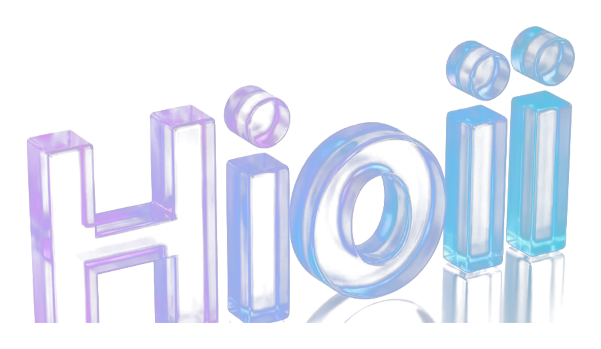
2048 · alphaCropped 3D render, background knocked out, real transparency. Drop straight into decks, Figma, video and social.
vector · alphaVector interpretation of the glass treatment: gradient body, sheen, refracted edge and floor reflection. Infinite scale, no pixels.
Download SVGBackground examples
Obsidian — preferred
hsl(240 7% 2%). Refraction and edge glow read at full strength.
Card / elevated
hsl(240 7% 7.5%) or gradient-surface. Safe for decks and slides.
Deep violet
Only above 60% darkness. The glass tints with the surface — check contrast.
Photography — dark
Low-detail, dark areas only. Never over faces, text or busy texture.
White / light — avoid
Transparent glass loses body. Use the flat gradient wordmark instead.
Saturated cyan — avoid
Accent-on-accent kills the refraction. Never place it on brand cyan.
Safety zone — 1× the “H”
Clear space on all four sides equals the cap height of the crystal “H”. Nothing enters it: no text, no icons, no image edges, no container borders.
dashed = clear space · solid = logo bounding box
Minimum sizes
180 px wideBelow this the inner refraction turns to mush.640 px wideRecommended target for landing pages and covers.45 mm wide @ 300 dpiUse the 2048 px PNG or the SVG; never upscale the 1024.12% of frame widthHold ≥ 1s on screen so the glass depth registers.180px · min
120px · too small
64px · too small
Do
- Place it on dark, low-detail surfaces and let it breathe.
- Scale proportionally from the PNG 2048 or the SVG.
- Pair it with Inter body copy and JetBrains Mono metadata.
- Use the flat gradient wordmark whenever the surface is light.
Don’t
- Recolor, rotate, stretch or add outer strokes and drop shadows.
- Put it on white, cyan or any saturated flat colour.
- Layer it over faces, text or high-frequency texture.
- Use it below 180px wide — switch to the mark or the wordmark.
Social previews — Open Graph & X
Every page of the brandbook shares the same crystal lockup on obsidian. These are the exact files wired into the og:image and twitter:image tags.
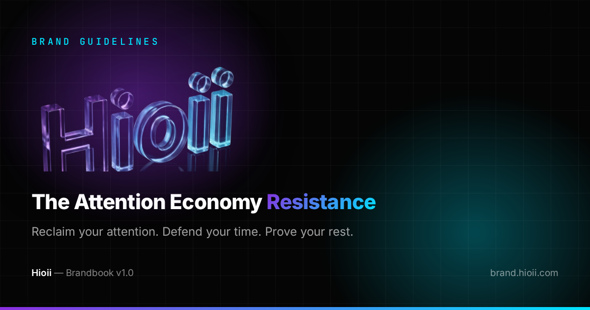
1200×630Facebook, LinkedIn, Slack, WhatsApp, Discord.
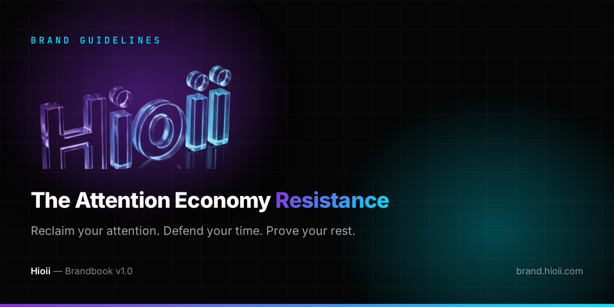
1200×600Same lockup, 2:1 crop so nothing is cut in the timeline.
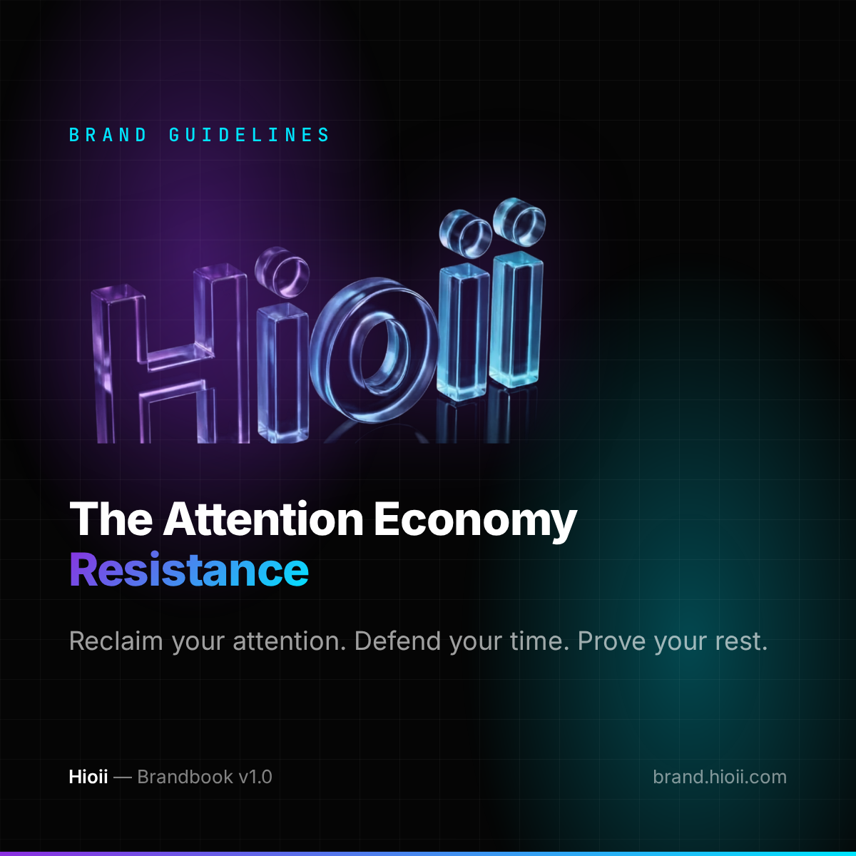
1200×1200Instagram and generic feeds.
Card recipe
- Obsidian canvas hsl(240 7% 2%) with violet + cyan radial glows, 4.5% grid.
- Crystal wordmark left-aligned, never centred, never over a light field.
- Headline in Inter 800, one accent word in the violet→cyan gradient.
- JetBrains Mono kicker in cyan, uppercase, 0.28em tracking.
- Footer line: wordmark + version left, domain right. 6px gradient rule at the base.
- Keep text clear of the outer 5% — social platforms crop the edges.
Previews are cached by each platform: after changing a card, force a re-scrape in their link debugger.
LinkedIn banners
Three ready-to-upload sizes for LinkedIn. Same recipe as the social cards: obsidian canvas, violet + cyan glows, crystal wordmark and a 6px gradient rule at the base.

1128×191LinkedIn crops the cover on mobile — keep the wordmark inside the left third.
Download PNG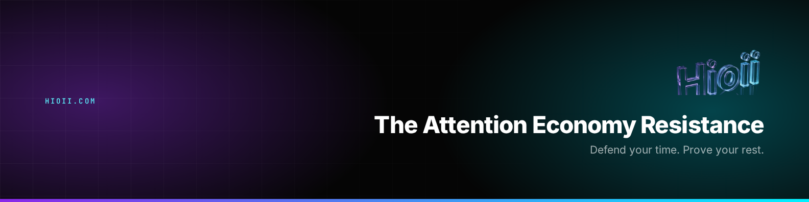
1584×396Lockup sits right-aligned so the profile photo and name never overlap it.
Download PNG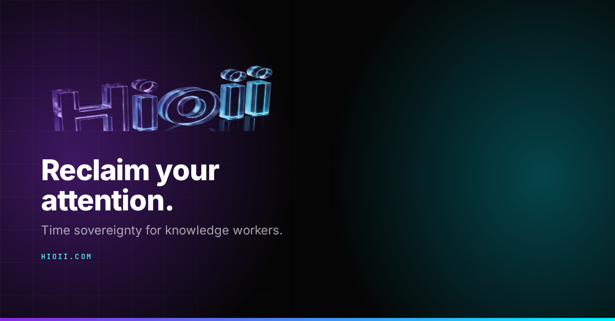
Banner rules
- Never stretch to fit — export at the exact pixel size.
- Keep copy out of the bottom-left safe zone on personal profiles.
- One message per banner: promise, not a feature list.
- Domain in JetBrains Mono, cyan, uppercase — nothing else competes.
- Gradient rule always touches the bottom edge, 6px, never thicker.
Google Play — Developer page

Google Play store kit — English
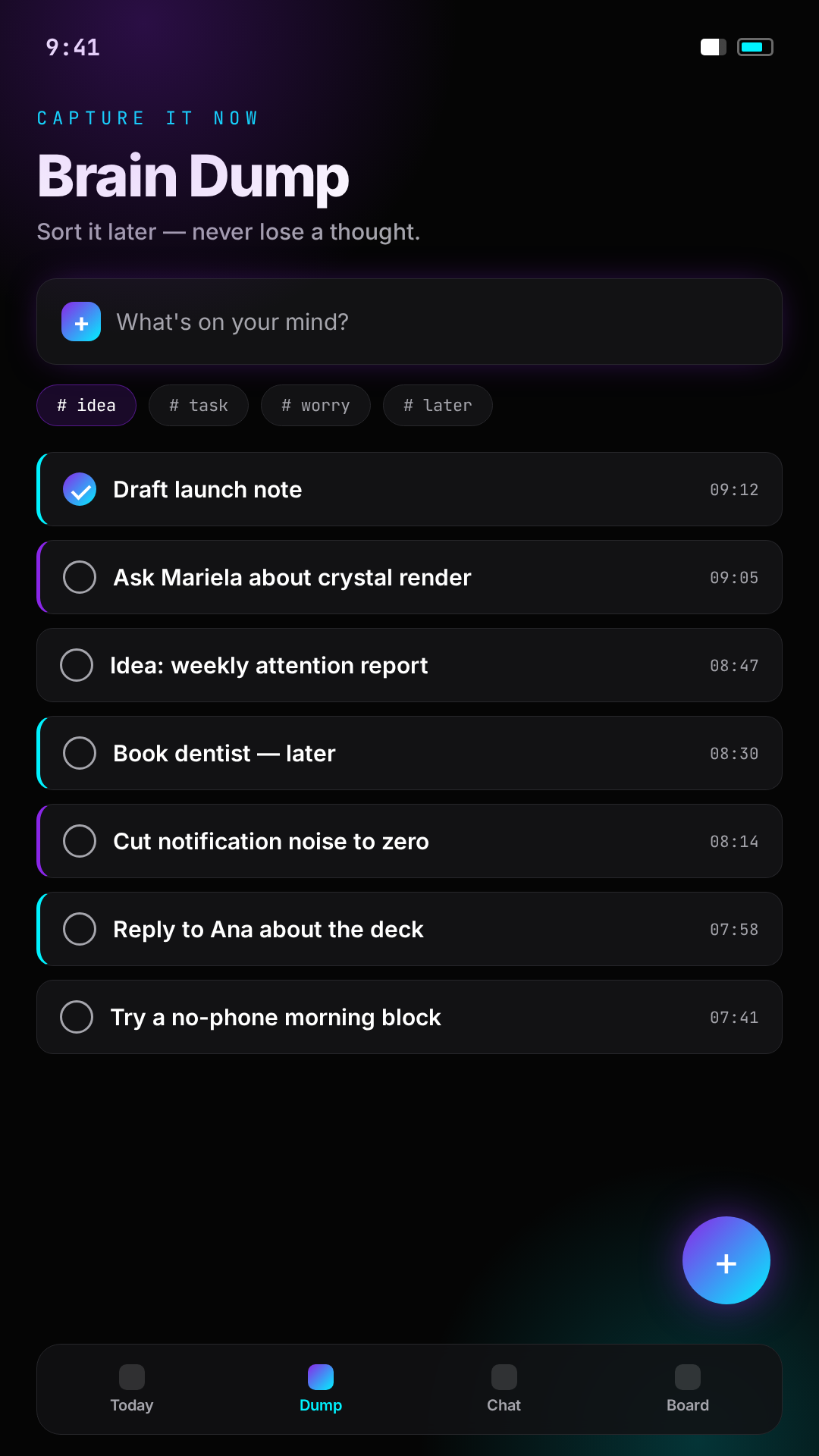
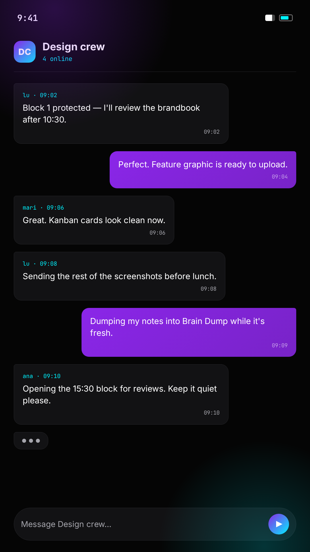
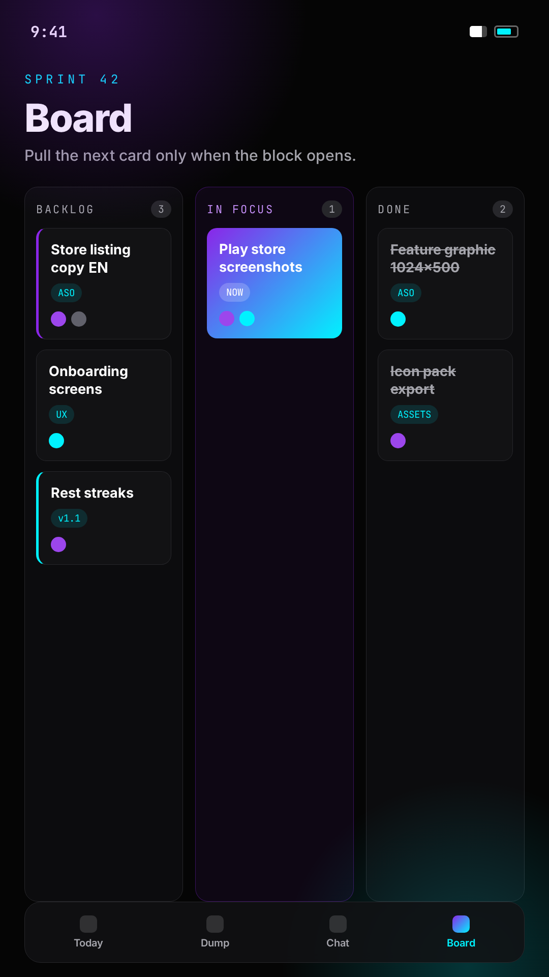
English images for the Play listing: the 1024×500 feature graphic and four 1080×1920 phone screenshots — TimeBox, Brain Dump, team chat and Kanban. Obsidian canvas, violet + cyan accents, mono time codes.
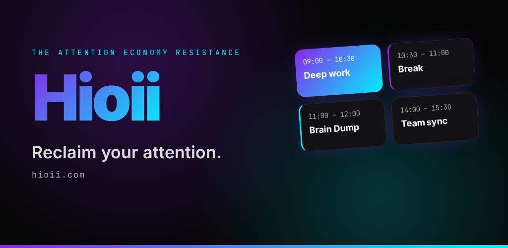
1024×500Hioii wordmark without a dot, English tagline and the time-block grid. Upload in Play Console → Store presence → Feature graphic.
Download PNG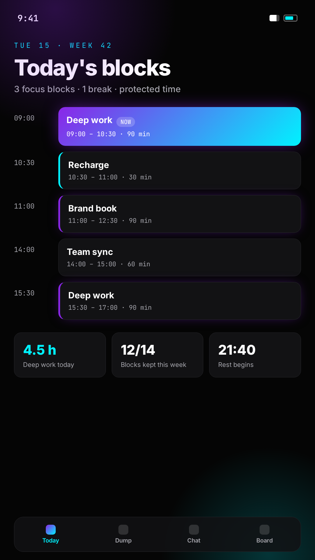
Short description — 80 chars max
ES · "Organizá tu día con time-boxing visual, Brain Dump, agenda y chat de equipo." (78)
EN · "Visual time-boxing, Brain Dump, smart agenda, and team chat for deep focus." (76)
ASO keywords
productividadtime boxingplanificador diariogestión de tareascalendarioenfoquebrain dumporganización del tiempotrabajo en equipoagenda inteligentedaily plannertask managementdeep focustime blockingteam chatsmart scheduleStore rules
- Feature graphic: 1024×500 exact, no device frames, text inside the safe zone.
- Screenshots: 1080×1920 — these four cover the core loop.
- Order: TimeBox first, then Brain Dump, chat, Kanban.
- Keep on-screen copy large — Play scales screenshots down hard.
- Never crop the wordmark; the gradient rule touches the base edge.
Icon pack — high-quality formats
The squircle app icon exported in every format and size, ready to drop into stores, browsers, decks and print.
.zip · 8 PNG + SVG + ICO + WEBP + JPGEvery export of the squircle icon in one archive: the full transparent PNG ladder (1024 → 16), both vectors, the Windows ICO, a WEBP for web and a flattened JPG for platforms without alpha. Includes a README with the usage rules.
Download icon pack






1024 → 16 pxMaster raster set with real alpha around the squircle. App stores, Figma, decks, web.
Downloaddark squircleInfinite scale, gradient wordmark on obsidian. Preferred for web and print.
Download
white squircleSame lockup on white for paper, invoices and light-mode documents.
Download

1024 px · q92Only where alpha is unsupported (some ad platforms, legacy email tools).
Download
Do
- Ship the exact size the platform asks for — never upscale a smaller PNG.
- Use the SVG whenever the surface can render vectors.
- Switch to the light squircle on white or paper.
- Keep the squircle silhouette untouched as the icon container.
Don’t
- Add a second rounded container, border or drop shadow around it.
- Re-crop, rotate or recolor the gradient wordmark.
- Use the JPG where transparency is supported.
- Go below 32px digital or 8mm print.
Downloads
JPEG · 4096×2304 · RGBOpaque developer page header, under 1 MB. Hioii wordmark without a final dot.
DownloadPNG · 2048×2048Wordmark violeta y cian sobre blanco con hioii.com. Documentos y presentaciones.
DownloadSVG · vectorVersión escalable sobre blanco, con zona de seguridad incluida.
DownloadPNG · 1024pxFull glass-block key visual with wordmark. For dark backgrounds only.
DownloadSVG · vectorScalable violet→cyan wordmark for docs, decks and light surfaces.
DownloadPNG · 2K3D glass-render wordmark with violet→cyan refraction. Hero and launch material only.
DownloadPNG · 1080pxCentered wordmark with hioii.com on near-black. Splash screens, social cards and end-cards.
DownloadPNG · 512pxGradient wordmark on white square. Light UI, app stores and documents.
DownloadPNG · 512pxGradient wordmark with alpha background. Overlays, decks and partner assets.
DownloadPNG · 512pxRounded black tile with gradient wordmark. iOS/Android icon and avatars.
DownloadPNG · 2048pxGlass render with alpha background. Dark surfaces, decks, video and social overlays.
DownloadSVG · vectorVector glass treatment: gradient body, sheen, refracted edge and reflection. Any size.
DownloadPNG · 1200×630Link preview for Facebook, LinkedIn, Slack and WhatsApp. Crystal wordmark on obsidian.
DownloadPNG · 1200×600summary_large_image card. Same lockup, tighter crop for the X aspect ratio.
DownloadPNG · 1200×12001:1 version for Instagram, avatars-in-feed and generic social posts.
DownloadPNG · 1128×191Company page cover. Crystal wordmark left, domain right, gradient rule at the base.
DownloadPNG · 1584×396Personal profile banner. Lockup right-aligned so the avatar never covers it.
DownloadZIP · 3 filesCompany cover, profile banner and post card in one archive.
DownloadPNG · 1024×500English store listing: Hioii wordmark without a dot, tagline and the time-block grid.
DownloadZIP · 6 filesFive English PNGs: feature graphic, four 1080×1920 screenshots and English listing copy.
DownloadDo not stretch, recolor, rotate or add effects to these files. Keep clear space equal to the height of the “h” on every side.
Motion & Interaction
Motion playground
Preview each pattern with adjustable duration and easing. Keep production motion inside the 0.20–0.40s brand range.
Pattern
Duration
0.30sBrand range: 0.20–0.40s
Easing
01:12:04
Deep work · Squad Aurora
animation: fade-in 0.30s cubic-bezier(0.22, 1, 0.36, 1) both;
GPU-first
Animate opacity and transform only. Avoid layout-triggering motion.
Calm
Durations 0.2–0.4s. No bouncy or aggressive easings.
Purposeful
Every motion guides attention or confirms an action.
fade-inPage transitions, content revealslide-upBottom sheets, modals, cardspulse-glowActive focus sessions, live statestime-pulseCountdowns, timers, running blocksBottom sheets
Swipe-to-dismiss on mobile.
Haptics
On completion, focus start, invite sent.
Bottom action bar
Preferred over floating buttons where possible.
UI Components
Buttons
- primary — gradient background, rounded-xl
- secondary — muted surface
- ghost — transparent, subtle hover
Extended FAB (mobile)
Pill-shaped with icon plus label. Avoid mystery-meat icons.
01:12:04
Deep work · Squad Aurora
7h 40m
−23 min
4 interruptions today
Real UI usage examples
Each variant shown in the situation it was designed for, with the rule for when to reach for it and when not to.
Buttons in context
One primary action per screen. Everything else steps down in weight so the eye lands on the thing that protects time.
hero — primary commitment
01:30:00
Deep work · no interruptions
- Use when the screen has exactly one decisive action: start a block, defend the calendar, confirm rest.
- Avoid two hero buttons side by side, or using it for navigation.
secondary + ghost — supporting actions
Block ends in 12 minutes.
- Use when the action is useful but reversible: reschedule, snooze, view detail.
- Avoid ghost buttons for destructive or irreversible actions.
destructive + outline — confirmations
Cancelling drops today's proof of rest streak.
- Use when confirming data loss: cancel a block, remove a squad member, delete rest proof.
- Avoid destructive as the resting state of a normal row action.
fab — mobile primary
- Use when on mobile, the primary action must stay reachable while the list scrolls.
- Avoid icon-only FABs; always pair icon with a label.
link — inline navigation
Interrupt penalties are calculated from your calendar.
- Use when the action lives inside a sentence or a dense settings row.
- Avoid stacking link buttons where a real button is expected.
disabled + loading
- Use when the action is unavailable until a precondition is met, or a request is in flight.
- Avoid hiding the button entirely — users lose the affordance.
Card patterns
Cards carry one idea each. Metric cards lead with the number; action cards lead with the verb; state cards lead with the status.
00:42:18
Deep work · Squad Aurora
Glow + pulse only while something is genuinely live. Never decorative.
7h 40m
Number first, label second, gradient reserved for the progress fill.
Plan tomorrow's blocks
Three protected hours are still unclaimed.
One action per card, full width at the bottom edge.
−23 min
4 interruptions today
Destructive tint on the border and number only — never the whole surface.
Spec review
09:00 — 10:30
Rest window
13:00 — 13:45
Squad sync
16:00 — 16:30
Rows use mono for time codes, sans for names. No per-row shadows.
Inputs and form states
Labels always visible, helper text under the field, errors in words rather than colour alone.
Text field — default
Shown to your squad in the timeline.
- Use when the value is short, named, and typed by hand.
- Avoid placeholder-only fields with no label.
Search field — icon affordance
- Use when the field filters a list already on screen.
- Avoid a submit button next to it; filter as the user types.
Invalid + disabled
Enter a full email address.
- Use when validation fails, or the field depends on an earlier choice.
- Avoid warning borders with no message explaining the fix.
Mono input — time codes
- Use when the value is a duration, timestamp or code.
- Avoid sans-serif for anything that reads as a number sequence.
Switch row — settings
Auto-decline meetings during focus blocks.
- Use when a boolean takes effect immediately, with no save button.
- Avoid switches for anything that needs confirmation.
Glass panels
Glass is for layers that float above content — headers, sheets, toasts, overlays. Never for a full page background or for a card sitting in normal flow.
End block early?
24 minutes remain on Deep work.
Rest proven · 7h 40m
Streak 12 days
Toast: glass over live content, auto-dismiss, one line of detail.
Glass rules
- Only over content it overlaps — headers, sheets, toasts, modals.
- Always add a 1px border so the edge reads on dark backgrounds.
- Keep text on glass at full foreground weight; never muted-on-muted.
- Full-page glass backgrounds or nested glass on glass.
Contrast Checker
Test any text/background pair from the brand tokens (or a custom hex) against WCAG 2.1 thresholds before shipping it.
01 — preview
Reclaim your attention
Body copy at 16px. Defend your time, prove your rest, and keep every focus block honest.
Caption / metadata at 12px
01:28:00
Contrast ratio
7.64:1
Brand rule: pair --muted-foreground only with --background or --card. Violet primary needs white text; cyan accent needs the near-black --accent-foreground.
Brand Kit Download
One zip with every logo file, the gradient swatches and the full CSS/JSON token export. Everything you need to build on-brand without guessing values.
hioii-brand-kit.zip
v1.0 · logos · gradients · tokens
- hioii-logo.png — primary key visual
- hioii-wordmark.svg — gradient wordmark
- hioii-mark.svg — lotus mark
- favicon.png — 64px square icon
- gradient-primary.svg / .png — 135° violet→cyan
- gradient-surface.svg / .png — 160° card surface
- hioii-tokens.css — colors, spacing, radii, glows, motion
- hioii-tokens.json — same tokens for design tools

